I still remember, and have never returned, the very first Hype magazine I read. I’d been bumming around Cinema City in Perth with a few crew one Saturday afternoon, when someone surreptitiously pushed a copy into my hands. Strangely enough, it was seeing Australian graffiti from outside of our own little corner for the first time that was the start of a life long passion for printed art media. I’d “acquired” a copy of Subway Art somewhere along the line, but this was the first real glimpse I’d seen of what was going on in the rest of Australia – in full blown colour – outside of a few locally made, (but cool) photocopied ‘zines. The glossy pages, the whole cars, my first glimpses of the lines here in Melbourne and across Oz, but, more importantly, the then unfamiliar names of writers that I still find myself following some twenty years later.
Before the advent of the Internet, magazines were a connecting point between far flung “subcultures” in Australia, and the rest of the world. These days, with blogs, Facebook, websites, Deviantart, online galleries and the sheer multitude of artists and work online, its hard to imagine the veritable isolation that the Australian graffiti and street art scene dwelled within back in the time before HTTP was a commonly sighted acronym. Magazines like Hype helped to build communication between the Australian street art community, – communication that we all too often take for granted these days – yet more importantly, however, magazines like Hype were inspirational.
With all the mutterings of i-Pads, e-Readers, Blogs and the web itself abounding with “print is dead” innudendo, it still feels a tactile pleasure to pick up a magazine full of inspiring work – something you can hold in your hands, turn a page, and gaze at the abundance of colour and style within.
There have been many magazines since Hype, which for Australian graffiti was game changing in many ways, and there will be many more to come, each morphing in different directions in order to encompass a modern take on urban content. It’s because of this love of the printed medium, and that inspiration found within these magazines, that we’d like to start putting the spotlight on the various Australian mags and books in print right now, and, one of the newest kids on the block, Dont Sleep Magazine, with its fresh take and style, is a perfect start.
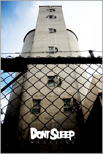
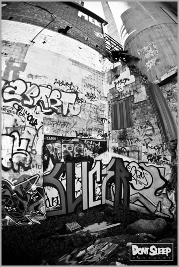
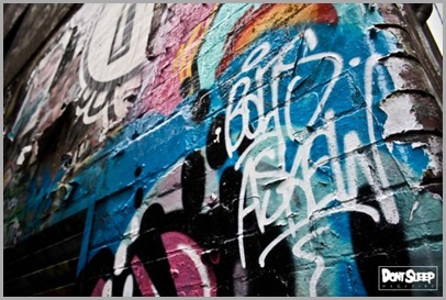
Dont Sleep is a lush, 60 page tome with a healthy dose of the explorative – its subject matter draws primarily on the richness of citified environments, with a plethora of grime, and its influences of street art, tattooing and urban decay are prominent. Dont Sleeps editor, Chico, has a decent eye for photographic and contextual flow, and doesn’t seem to get caught up in monotonous strips of trains and walls.
So, all diatribe aside, read on and get a feel for the creative behind Dont Sleep and its sister ‘zine, The Ruins, then go and buy a copy of them when you’re fuckin done – because, though we all love blogs as much as we do, there just aint nothing like that waft of fresh ink on the turning of a new page …
So, can you give us a brief rundown on who’s behind Dont Sleep, and where you got the idea to do it?
At the moment it’s just me, Chico … one man army, homes! Before Don’t Sleep, I had a photo blog called FUCKHEAD, it was pretty much the magazine, but in blog form. After getting a solid following from people all over the world in a short amount of time, and coming to realise that people out there liked what I did, I wanted a better way of showcasing my photos – inevitably, I thought a magazine would be a pretty good way to do that, so I just went out and did it. I’ve always wanted to start something of my own, and I’m pretty stoked about how it’s turned out.
What’s the philosophy behind the magazine, what do you feel you do differently to other mags and what are your goals?
I guess the fact that it isn’t just page after page of walls or trains – that makes it a little different – but also because it has close to no text in it. It’s also a lot smaller than other mags, because I wanted to give it that “small book” feeling that people could collect, rather than the standard magazine look that may eventually get thrown away, and I think I’ve succeeded with that. In terms of goals, well I definitely want to release more issues of Don’t Sleep, The Ruins, and maybe release some t-shirts and hoodies to go along with it all.
How do you select both the artwork and the artists that you want to feature?
A lot of the artists that I document are people that I know, so it’s only natural that I feature a lot of them – the magazine probably wouldn’t be around if it wasn’t for them.
Who and what have been some of the primary influences behind wanting to do the magazine?
Following street-wear brands like The Hundreds, Supreme and Rebel8 has been one of the biggest influences for me, as well as seeing good photography – I also just like the general idea of being my own boss.
How did you find the entire print media process, from putting it together to the final product? What was the most difficult aspect before getting it out onto the shelves?
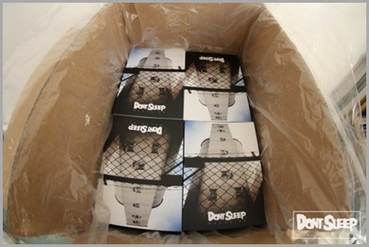
Well when I first set out to make the ‘mag, I had no idea what I was doing, really. I mean I knew the basics but that was it – my brother pretty much showed me how to do most of it. I remember telling a friend about my idea and they mentioned an ISSN number, I was like … what? So I did some research, and thought I had it sorted out, only to get all the magazines delivered with no barcode on the back – but that was easily fixed. I guess the most difficult aspect of putting it together was deciding what photos to use.
How do you primarily source the images for the magazine? From the artists, your own photography, or a general “find whatever the hell looks awesome” attitude?
The majority of the photos are mine. I like showing the gritty parts of a city so I choose alleys, graffiti – just streets in general, as my primary subjects. That’s what I find interesting, and its what I’m around every day. It’s not like I’m in a studio taking photos of models or anything, although that wouldn’t be too bad! If I like a photographers style or the subjects they photograph, then I’ll contact them – I don’t want people just sending me photos of pieces they’ve done.
You focus on the street aspect of the artists a lot, but dotted throughout the first issue are a fair few pieces of less traditional stuff, for example body painting and a bit of design – with the art you want to represent in the magazine, where do you guys stand on the whole street vs commercial & gallery argument, or do you believe that they are all one and the same?
Well graffiti started in the streets, so I guess it belongs there more than it does in a gallery – but at the same time people have to make a living. I’m not a writer so I can’t really say much. I don’t really like when you hear someone say ‘that person’s a sell out’ – because, really, if you love something and you have the chance to make a living off of it, then why not? It’s better than working some 9 to 5 job that you hate.
You have a great online web presence, in the form of your blog that went up recently, but where do you find that this fits into the traditional print-format – in the time of online blogs and iPads, do you think that one can exist without the other anymore?
I think a blog is a really good way to show off your work to people all over the world, it gives them a chance to see your work every day, not just twice a year or whatever. These days I think it may be hard for a magazine to exist without a blog, or a good website, because that’s one of the ways that people find out when something is being released, where it’s going to be sold, how much it’s going to be, etc etc. Digital may be the way of the future, but there’s nothing like having photos right in front of you in print form – and you just can’t collect a blog.
How have you found the reception to the magazine so far?
Really good, I was kind of unsure about how the public was going to respond, but so far so good. I mean – there’s probably a lot of people out there who diss it, and say it’s too arty and not a proper ‘graff mag’. That’s cool by me, though. There’s always going to be haters. and besides, I don’t really want Don’t Sleep to be labelled a ‘graff mag’, sure that’s the main focus of it, but I just want it to appeal to a mixed group of people – not just writers.
Is there anything you will do differently for the second issue, now that you have had the first issue out the gate, or are you happy with the format you’ve achieved?
I’m pretty happy with how it looks – maybe I’ll change it up just a little bit here and there. I definitely want to find some more photographers and put their work in there. I’ve already started laying out the second issue – I’ve had some really good contributions, so it’s looking dope!
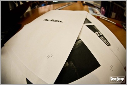
The Ruins looks like a great idea, small limited run mags harken to the whole underground zine movement, in contrast to the big glossy, and has its own unique appeal – what’s the story behind it and do you plan a lot of other smaller runs like it?
I think I’m a pretty impatient person, so I just wanted to do something before the second issue of Don’t Sleep came out. The Ruins is just photos of everyday stuff, heaps similar to Don’t Sleep, just no graff. I’d hadn’t made a ‘zine before so I wanted to give it a go. There’s something about the look and the effort that goes into making ‘zines that interests me – you don’t just lay it out and send it to the printers, you are the printers! It’s fun and creative, like the glossy magazines ghetto cousin! I like it, and I’m going to try and release an issue every 2 months or so.
What do you hope your readers will get out of picking up a copy of Dont Sleep?
An insight into my world, and the way I view Melbourne, or any other city I may happen to visit…
You can buy a copy of Dont Sleep and its sister ‘zine The Ruins online, as well as at a number of stockists around Australia. You can also peruse its eclectic blog at the Dont Sleep website.




Leave a Comment
Your email address will not be published. Required fields are marked with *