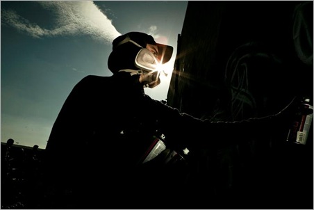
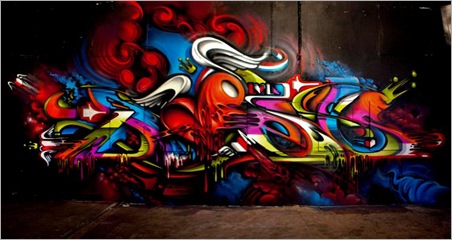
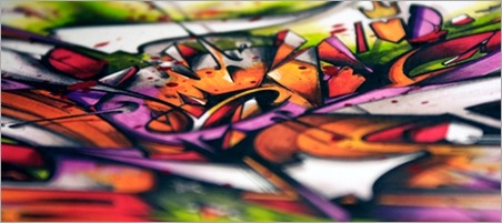
DOES is a man in love with letters. Recently, this Dutch artist has been making waves down under, with both his intricate letterforms and his enthusiastic translation of calligraphic symbols into swathes of colourfully saturated, alphabetic beauty.
For nearly fifteen years, the breadth and scope by which this artist has portrayed this love is remarkable – walls, prints, paintings and his commercial design work have all been placed under the persuasive sway of his craft. In his mission to take his work to the world, his recent sold out show, I Love Letters, at the Lo-Fi Collective in Sydney proved a testament to both his ability and reverence for his letters. Equally, as if to prove that there is no rest for the wicked, his next solo show in Australia, Between The Lines, held at Rancho Notorious in Melbourne this week, looks set to continue this passionate example of an artist bursting in raw, enthusiastic respect of the written word.
We were thrilled to be able to get some of DOES time for a few questions whilst he is down here travelling, and we know you’ll be just as captivated as we were when we first read his replies – its hard not to be, because, really, who amongst us doesn’t love letters?
You’re originally from the Netherlands, but you have travelled the entire world – recently you’ve been travelling Australia and getting up, exhibiting and generally making your mark here – can you tell us a bit more about your travels abroad, and here, in the past few years?
Travelling is one of the best things of my life, after soccer. I used to be constrained by training schedules and weekend matches, but now I can come and go where and when I please. The great thing about travelling is the openness and genuine curiosity of the people you meet – when you travel, you are often a guest in someone’s home and that makes for truly unique experiences.
In a time when people are expanding out and exploring alternate forms of both graffiti and street art, you have concentrated in utilising the letter as the basis for the majority of your work – what is it about the vast arrays of alphabetical icons that keeps you constantly inspired?
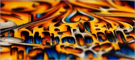
What I like about letters is they offer a strong basis from which you can experiment freely and discover many different forms and shapes. Although I like to experiment with forms and shapes, I do try to stay true to the basic form.
The general notion that every single person has a unique hand style that can offer insights into someone’s personal traits is appealing to me. It enforces my belief that the form and shape of letters embody a certain emotion.
There’s something vibrant and alluring about the colour work in your art, can you tell us how you usually go about setting out your colour palettes? Do you go into it with a specific idea as to what tones you want to use, or is it a very free flowing thing?
A lot of my choices in colours are based on colour combinations that you see in natural landscapes. For example, a sunset shows you many different colours that all fit perfectly together. I try to look at what colours will go well together when deciding on a colour scheme.
How about your work with Ironlak? How long have you been working with them, and how did becoming a member of Team Ironlak come about?
It wasn’t until Ironlak approached me, approximately two years ago, that I started learning about their paint. The Ironlak guys have made a strong mark in the graffiti and paint industry and they are still trying to improve and grow with us. Their dedication and commitment to the Ironlak family and many other writers is honourable.
You’ve even had an Ironlak artist series colour named after you – Dieci Does – which has turned out to be a favoured tone by many artists – what’s the story of the colour itself, the idea and concept behind it?
I really like this colour, because you can use it in almost all the colour palettes. Dieci stands for the number 10. It is a reference to the shirt number I wore when I was a professional soccer player. My Dutch background might have played a tiny role as well when picking the colour – orange is the colour of our national soccer team.
We’d love to get a bit more of an inside story on the I Love Letters Collective – you initiated the concept for the crew, and from there its gone from strength to strength – what do you believe is the secret to forming a sturdy collective of artists, and what do you believe it is about I Love Letters that brings something unique to the art and design world?
I think it is very interesting that all the crewmembers have different specialties in art besides graffiti – such as photography, graphic design and sculpture works. Everyone is trying to develop their skills in different ways, and we can be a team when it comes to graffiti – a love that unites us. Another important element to the crew is that we all know each other personally. We don’t all live close to each other, so it isn’t possible to paint with the whole crew on a regular basis, but we do aim to paint together at least once a year.
Your show, I Love Letters, at Lo-Fi in Sydney, was a sell out event – beyond that success, what were your impressions of your Sydney experience, and what are you most looking forward to with your new and up coming show in Melbourne, as well as your trip here?
What strikes me most so far is how receptive Australia is to graffiti art.
As for Melbourne, I have heard that it has an even bigger art scene than Sydney, so I can only hope that this show will again be a success.
You also have some work in Adelaide with the Indelible show – can you tell us a bit more about your involvement in that – will you be heading to Adelaide at all?
I would love to drive to Adelaide and see the show. Unfortunately, I won’t make it to the opening of the Indelible exhibition on Friday the 15th of April as the opening of the Between The Lines exhibition is on Thursday the 14th of April. Both shows last for about two weeks, so I hope to make it to Adelaide in time.
Being as prolific as you are, you have even contributed to the newly released Street Fonts book. What are your thoughts on how it all turned out? We have yet to get our hands on it, but it looks amazing.
The Street Fonts book has come out really well, lots of credits to Claudia, aka Mad C, for putting it all together and publishing it. The alphabet I did for the book was designed a little while ago, so I would probably do it a bit differently again now. I am happy with it, but I find that after a while you see things differently. I guess that is part of the process of developing your personal style.
Where have been some of your favourite places in the world to paint?
Some of my favourite places in the world to paint:
– Basel, for its memory of Dare.
– Bogota, for its thrill and excitement of the unknown.
– Melbourne, for its great vibe.
– New York, for its graffiti history.
What is the best thing about this life you lead? The people, the walls, the travelling, or just the art itself – what do you see yourself doing for the rest of the year, and the rest of your life?
Its a combination of many things that makes it so good – meeting new people, painting new walls in unexpected places, exploring your own boundaries and travelling the world.
This year, until July, I see myself travelling through Australia, New Zealand and Asia. When I get back to Europe I’ll be painting at a few festivals and working towards some new exhibitions – and then I’ll go from there.
You can check out more of Does work on his website, Digital Does. Also check out the Rancho Notorious website for details as well as the Facebook event page for his upcoming show, Between The Lines.
Images (1) & (3) courtesy Luke Shirlaw.




Leave a Comment
Your email address will not be published. Required fields are marked with *